The Other New BusinessWeek

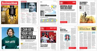
The BusinessWeek redesigns just keep on coming—but this time around it’s our print colleagues taking the wraps off a shiny new package. Magazine creative director Andrew Horton and the folks at Modernista! have been hard at work retooling “the book” from top to bottom, and the finished product hit newsstands Friday. Go check it out. You could say I’m a little biased, but I think it’s been a long time since a business magazine looked this good. Clean layouts, distinctive typography, and a new no-nonsense minimalist logo.
News Types
My current office obsession is poring over the new typography. For purely selfish reasons of course—I can finally start using these new faces online! And there’s plenty worth digging into here.
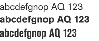
First up is Berthold’s Akzidenz Grotesk, Helvetica’s direct ancestor. (Indeed, while Helvetica was celebrating its 50th birthday this year, Akzidenz was gearing up for its 110th.) BusinessWeek's cut includes the great condensed version that the new logo is set in. It’s a genuine retooling, not some clumsy squashed knockoff of the regular face.

For body copy there’s Cyrus Highsmith’s Quiosco, a typeface constructed specifically for newsprint legibility. Which it achieves, with personality, thanks to quirky inner and outer letter shapes. It also has what I consider to be a must for large swathes of newsprint copy: a full set of titling and text figures (aka, “old style” numbers).

Type wonks may recognize Quiosco from the 2007 Type Directors Club Competition. Unlike Akzidenz, this font is barely into its second year of existence. A newborn paired with an 1890s Realist old-timer. Historical juxtaposition makes my inner typophile smile.
Kissin’ Cousins
The only real change for the website involved—naturally—swapping in the new logo and tweaking the navigation. I was never really happy with the old “grey box” highlighting, and always saw it as something we’d eventually revisit and refine. Fortunately, the new magazine made this a cakewalk by setting up a strong graphic language to work with.

The resulting navigation is cleaner and clearer by far. (So much so that some folks think we redesigned the site again!)
With time I’m sure we’ll be making more style nods to each other, where appropriate. The idea is that the magazine and the website do what makes sense for their respective mediums, but remain squarely synced with the overall BusinessWeek brand. Cueing off of, but not slavishly imitating, each other.