The New Look at BusinessWeek.com
Well, the cat’s out of the bag. (Actually the cat’s been out of the bag and running excitedly around the house for a while now, I’ve just been too busy to write about it.) About a week and a half ago my design update to the main BusinessWeek.com homepage went live.

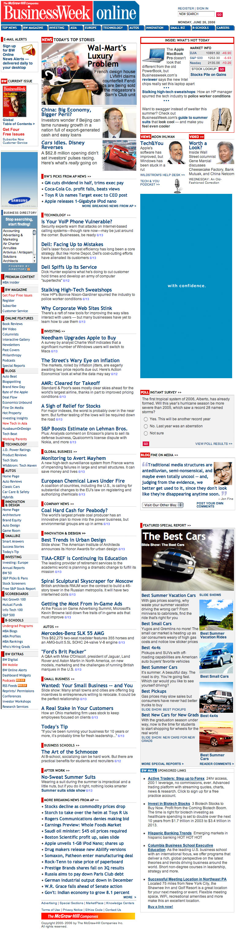
Here are some full screenshots of the before, and the after.
The first and foremost guiding principle of this “facelift”? This site is about news. To that end I wanted to create a clean, practical grid to keep things legible and organized, while corralling a lot of the digital dust bunnies that had managed to tumble their way onto the page over the years. It also meant adopting modern Web Standards wherever possible with open arms. Think of it as “unpimp the site”.

The new page uses a slightly modified faux columns layout, with a center column devoted exclusively to news content. It’s a more manageable, smarter way of laying in those gray borders between the columns. Don’t forget, faux columns don’t just have to be for column backgrounds—you can use them for column borders too! This frees you from having to use padding in the main layout CSS, neatly sidestepping any box model wrestling with Internet Explorer that would be required because these columns declare an explicit width.
That’s no small benefit either. When you get a site with an audience the size of BusinessWeek's it’s important to keep the CSS hacks and filters to a judicious minimum. I find that the issues seem to grow exponentially with each successive hack or filter you add. And when millions of people are hitting your page everyday, they’re going to find the problem spots.
I say “slightly modified” faux columns because of that spot at the top of the first column where the main headline area and Market Info box go. These pieces get a background-color which neatly hides the border image underneath, creating some whitespace and making it appear that the border begins well below them.
That main headline spot is also worth some discussion too. For some time now BusinessWeek has been placing headlines over it’s main art using CSS. It’s a pretty unique setup for a news site that presents its own challenges, but one that I felt was worth keeping. To simplify things I pulled as much CSS out of the page as possible (this was all done as inline CSS previously) and created a series of stock layouts in the external CSS files. One piece of CSS does have to remain inline though: the background rule. Since many browsers cache CSS so aggressively it would be unwise to place this in the external CSS and edit it on a daily basis. That could lead to some embarrassing moments—if only once in a great while—where the headline and the image behind it wouldn’t match. Old art + current news = not good!
This new setup only requires that you modify two values (both in the same class attribute) to update the look of the main headline’s text. One value controls the color, the other controls the layout itself. This makes things much easier on the people creating the art (who know exactly where the areas of interest in the image can be) and the people updating the page (who only have to edit two words to completely change the layout of the text).
Oh yeah, did I mention it’s all XHTML 1.0 Strict? That part turned out to be far easier than I expected, so we went for it. All that was needed was a little bit of education (“You mean I have to encode ampersands in URLs too? Really?”) and a smattering of JavaScript to massage content we can’t modify.
And now it’s back to work! There’s still much to be done, and as always we have plenty more goodies in store, so stay tuned.